
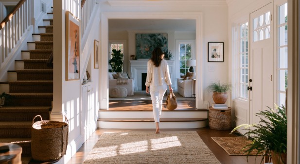
A renter starts making decisions fast. The walk to the front door matters. The condition of the threshold matters. The first few feet inside matter more than many owners think. Once the door opens, people start reading the home before they have seen the spaces that usually get the most attention. If the entry feels dim, cramped, or improvised, the rest of the home has to recover from that first read. If it feels calm, useful, and finished, the whole showing starts on firmer ground.
That is why proper furniture in the front hall deserves more thought than it usually gets. The entry is not there to impress for ten seconds and then disappear. It has to handle daily life, create order, and help the home make sense right away. For owners who want a more polished look, luxury hallway furniture can help establish the tone of the space, but the bigger goal is not to make the home feel expensive. It is to make the home feel intentional.
Most visitors will never say that out loud. They will not stand in the doorway and comment on scale or proportion. They will simply register whether the home feels easy to step into. That quiet reaction matters. It shapes how they read the rooms that follow, how well they imagine living there, and how much confidence they place in the property from the start.
Why the entry changes the mood of the whole home
The front entry works like a preview. It tells people what kind of care they should expect from the rest of the house.
If the first sightline is messy, the light is harsh, and the walkway narrows the second the door opens, people start reading the home as harder to live in. If the entry feels clear and settled, they begin giving the rest of the property more grace. A room that might have felt ordinary can come across as comfortable. A layout that is not perfect can still feel workable. The opening impression changes the way everything else is judged.
That matters for rentals as much as sales. Prospective renters are not just reviewing square footage or checking appliance finishes. They are trying to picture how the place would feel on a Monday morning, at the end of a long day, or when friends stop by. The entry sets that emotional baseline faster than almost any other spot in the house.
In my experience, owners often spend time on the living room and kitchen because those spaces feel more important. They are important. But the front hall is what prepares people to see those rooms in the best possible light. When the entry feels neglected, the rest of the home starts with a disadvantage it did not need.
That same logic shows up in Bottom Line’s post on rental property curb appeal. The article focuses on exterior presentation, but the principle carries inside. People build trust in a property through a sequence of signals, and the entry is one of the strongest of them.
What proper furniture is actually supposed to do
A lot of entry advice gets stuck on looks. Looks matter, but they are only part of the job.
Proper furniture in this part of the home should do three things. It should give the eye somewhere to land. It should support the routines that happen at the door. And it should connect the front hall to the next room without blocking movement or adding stress.
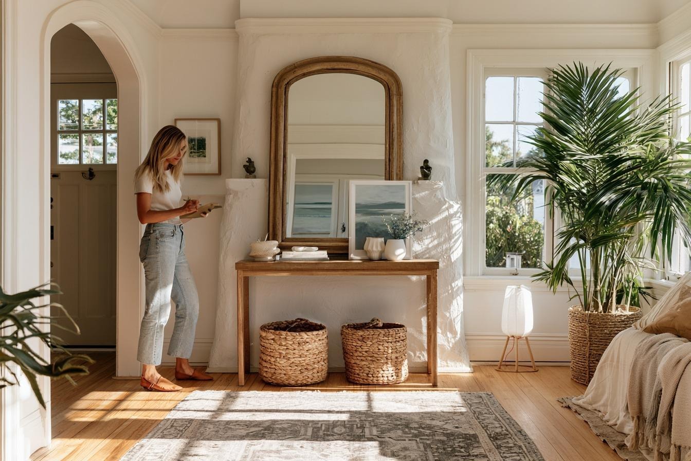
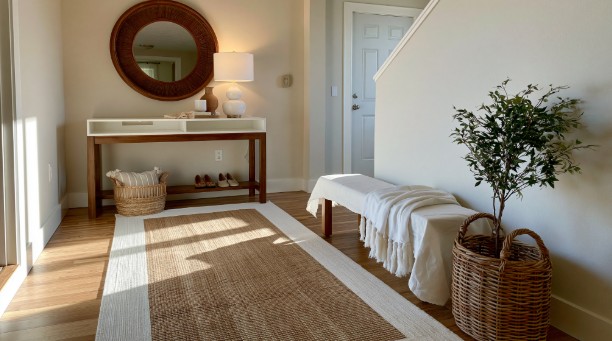
That first job is visual. A narrow console, a bench with some presence, a mirror, or one strong wall piece gives the area a center. Without that, the entry can feel like unfinished spillover space.
The second job is practical. Keys, bags, packages, shoes, and loose paper all tend to collect near the door because that is how people live. When an entry has no surface, no drawer, no tray, or no place to pause, clutter is almost guaranteed. That is not a discipline issue. It is usually a setup issue.
The third job is transitional. The front hall should introduce the rest of the home, not compete with it. A small entry does not need many pieces, but the ones that are there should help the home read as one continuous space. When the hall feels disconnected from what comes next, the whole layout can seem less resolved than it really is.
The pieces that usually carry the load
Most entries do not need a full collection of matching pieces. They need one or two decisions that solve the right problem.
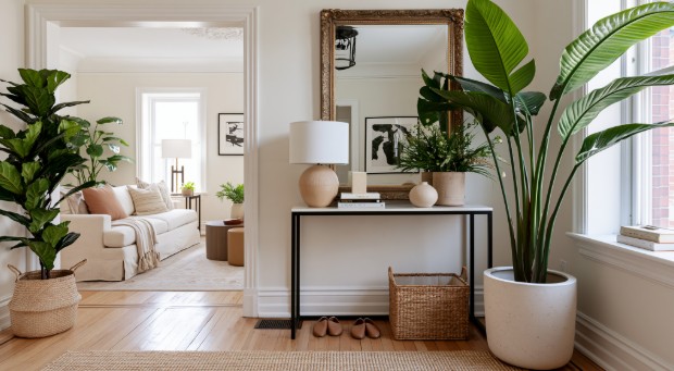
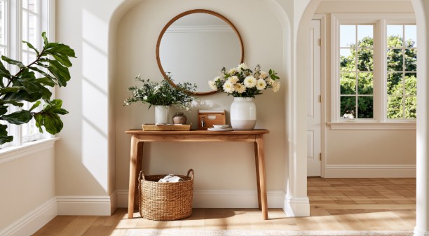
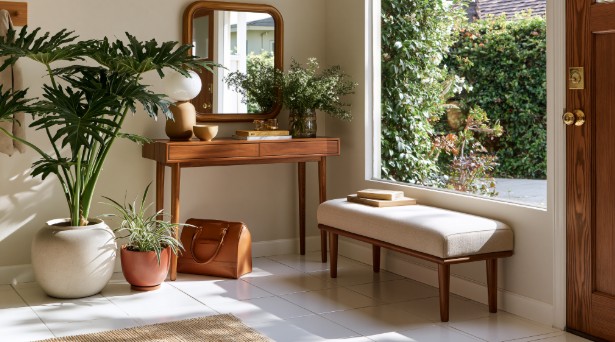
A slim console often does the heaviest lifting. It gives the wall purpose, creates a place to set things down, and helps the entry feel anchored instead of empty. In a narrow hall, open legs usually help the piece feel lighter. In a larger foyer, drawers can be worth more than visual lightness because they hide the loose items that build up during normal use.
A mirror is often the second strong move. It finishes the wall, gives the space some height, and adds a quick-use function that people actually appreciate. But a mirror is not automatically the answer. If it reflects clutter from another room or amplifies visual noise near the door, art can create a calmer result.
A bench earns its place when people really need it. In a busy household, a place to sit while taking off shoes is not a decorative extra. It is useful. The problem is that benches get added to entries that do not have the width to support them. Then the bench becomes the obstacle everyone squeezes around.
The best test is simple. Every piece should justify the space it takes up. If it does not improve flow, daily function, or the first read of the room, it is probably not helping.
The mistakes that weaken a first impression
The most common mistake is scale. A piece that looks narrow online can feel bulky the moment it lands near a front door. A few extra inches of depth can change the whole experience of walking in, especially when someone is carrying groceries, a backpack, or a child.
Another common mistake is leaving the entry too bare. Owners often worry about clutter and respond by stripping the space down to almost nothing. Sometimes that works. More often, it makes the front of the home feel unfinished. A blank wall and an empty floor rarely read as thoughtful. They usually read as unresolved.
Lighting is another weak point. Many entries rely on a single overhead fixture that flattens everything. Even a good furniture layout can feel colder than it should under the wrong light. A lamp on the console, a warmer bulb, or a better fixture scale often changes the mood faster than another accessory ever will.
Then there is the drop-zone problem. Shoes pile up. Keys drift. Mail lands wherever there is room. Delivery boxes sit by the door longer than anyone planned. People do not do these things because they do not care. They do them because the entry is not helping them do anything else.
The last mistake is over-styling. Too many accessories, too many matched finishes, and too much effort to make the area look staged can backfire. The entry should feel cared for, not rehearsed.
A simple way to choose the right setup

The easiest way to make better decisions here is to stop asking what looks good in isolation and start asking what the space needs.
Start with flow. Open the front door and take an honest look at the path. Can two people pass through without turning sideways or bumping a corner. Can someone carry bags in without fighting the furniture. If not, the layout is too ambitious for the footprint.
Then check function. What actually lands here every day. Keys. Shoes. Bags. Pet gear. Mail. Umbrellas. If the entry has no plan for those items, it will start looking messy no matter how attractive the furniture is.
Next comes the focal point. What does the eye land on first. One good move is stronger than several small ones. That could be a console with the right shape, a mirror that settles the wall, or a single piece of art that gives the space some identity.
Finally, look at the finish. Does the entry feel related to the next room, or does it look like a different idea started at the door. The materials and tones do not need to match exactly, but they should feel connected.
This is also why presentation matters so much in rental homes. Bottom Line’s post on creating Gen Z-ready spaces leans into the same reality, people respond well to spaces that feel ready, usable, and current without feeling forced.
The trade-offs owners should think through
A wide foyer and a narrow hall should never be furnished the same way. That sounds obvious, but it is one of the easiest mistakes to make because inspiration photos usually come from homes with more breathing room than the average rental.
An open console keeps the area visually light, but it leaves daily clutter exposed. A closed cabinet hides the mess, but it can feel heavier than the space can handle. A bench adds real function, but it can cost valuable walkway. A mirror can lift the wall, but it can also double the visual mess if the surrounding view is busy.
Rental owners have another trade-off to think through, which is durability. The piece that looks best on day one is not always the one that holds up through turnover, shoe traffic, and repeated use. In my honest assessment, the best-looking entry is often the one that still works after a few months of ordinary life. It is easier to keep a restrained setup looking sharp than to keep a more elaborate one looking fresh.
That is one reason turnover thinking matters here. Bottom Line’s Move In/Move Out Checklist is built around condition, readiness, and a smoother handoff between residents. The entry sits right in the middle of that handoff. It is where a home starts to feel move-in ready, or starts to feel like a project.
The five-minute reset that changes the read
A stronger first impression usually does not come from buying more. It comes from a faster reset and a better setup.
Turn on the softer light source if there is one. Clear the surface so it is holding only what needs to be there. Get the shoes into a basket, cabinet, or closet. Wipe the mirror. Straighten the rug. Check the first sightline into the next room and remove whatever makes it feel noisy.
That last step matters because people do not experience the entry as a separate idea. They experience it as the start of the whole home. If the front hall feels composed, the living room often looks better. The kitchen feels less chaotic. The property reads as more settled.
That is the real value of proper furniture in the entry. It is not there just to decorate a blank wall. It helps the home communicate care, ease, and readiness before the rest of the showing has a chance to speak.