



For years, cool grey was the default neutral in modern homes. Today, designers are moving toward something softer and more welcoming: warm neutrals. Shades like taupe, mushroom, oatmeal, sand and greige bring the calm of a neutral palette with an added sense of warmth and comfort.
When paired with natural textures such as linen, these colors create interiors that feel refined, timeless and inviting. Here is how to use warm neutrals to give your home a quietly elegant look.
Why Warm Neutrals Are Replacing Cool Grey
Cool greys can look crisp and contemporary, but in many homes they feel cold, especially in rooms with limited daylight. Warm neutrals have yellow, red or brown undertones that react beautifully to both natural and artificial light. They glow in the morning, soften in the evening and make a space feel lived-in rather than sterile.
They are also remarkably versatile. Warm neutrals suit traditional homes with moldings and wood floors just as well as modern apartments with clean lines. That flexibility is one reason they appear so often in luxury residences and boutique hotels.
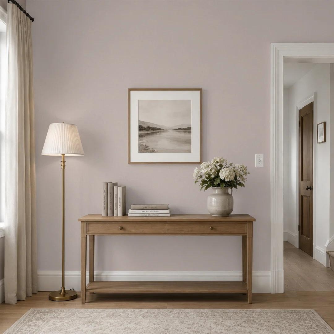
Taupe: The Designer's Favorite Neutral
Taupe sits somewhere between grey and brown. It has the sophistication of grey with the warmth of beige, which makes it one of the most forgiving colors to decorate with. It pairs equally well with crisp white, deep charcoal, warm wood and brass.
On the walls, taupe wallpaper creates a rich yet calm backdrop. A textured finish adds depth, so the color shifts gently through the day rather than looking flat. Taupe works particularly well in:
Living rooms, where it creates a welcoming, cohesive base for furniture and art
Bedrooms, where its softness helps the room feel restful
Hallways and entrances, where it sets a refined first impression
Dining rooms, where it flatters candlelight and warm lighting
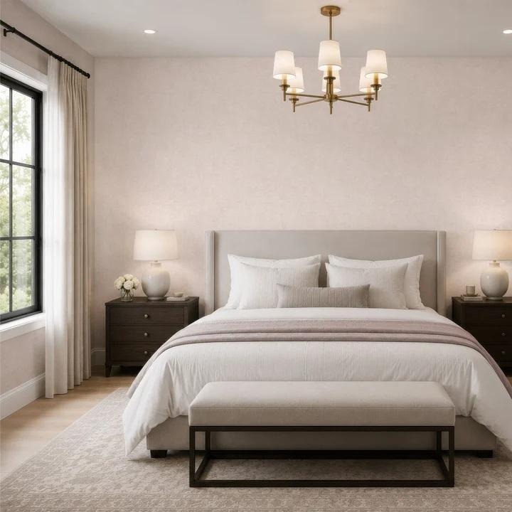
The Role of Texture in a Neutral Scheme
A neutral room relies on texture to feel interesting. Without it, even the most beautiful colors can appear bland. Texture adds visual weight, creates subtle shadows and invites touch, all of which make a space feel more luxurious.
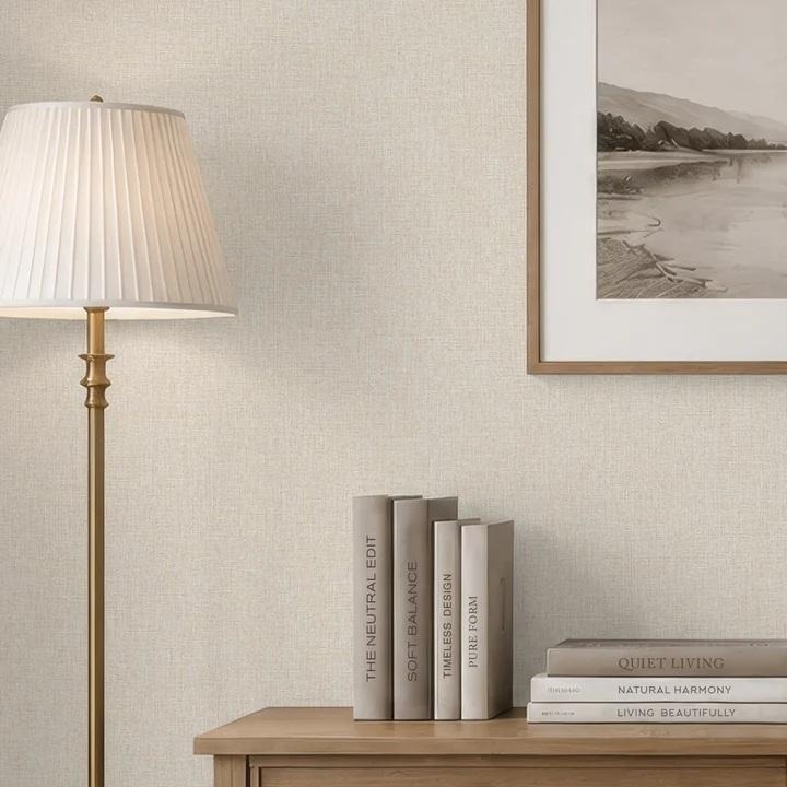
Linen is one of the most effective textures for warm neutral interiors. Its natural irregularity and soft weave bring an organic, tailored feel. A linen texture wallpaper in oatmeal, sand or soft greige gives walls the look of fine fabric, adding warmth without introducing pattern. It is a classic choice for rooms where you want understated elegance rather than a statement.
How to Combine Taupe and Linen Tones
Taupe and linen shades are natural partners. Here are a few ways to combine them:
Two-tone walls: use taupe on a feature wall and a lighter linen texture on the remaining walls for gentle contrast.
Room-to-room flow: choose taupe for a living area and linen tones for an adjoining hallway or bedroom, creating a cohesive palette throughout the home.
Layered textiles: pair taupe walls with linen curtains, cream bouclé chairs and wool throws.
Natural materials: add oak, walnut, travertine and rattan to deepen the warmth.
The key is to vary the tone and texture slightly, so the room feels layered rather than monotonous.
Accent Colors That Work With Warm Neutrals
Warm neutrals are an excellent canvas for carefully chosen accents. To keep the look refined, introduce color in small, considered doses:
Olive and sage green for an earthy, botanical feel
Terracotta and rust for warmth and depth
Deep navy for classic contrast
Soft blush for a gentle, romantic touch
Black details in frames, lamps or hardware to add definition
Lighting and Finishing Touches
Warm neutrals look their best under soft, layered lighting. Use table lamps with linen shades, wall sconces and dimmable fixtures to create pools of light. Warm bulbs enhance the golden undertones of taupe and linen, making the room feel even cozier in the colder months.
Finish with natural accessories: ceramic vases, stacked books, framed prints in simple wooden frames and a few branches or dried flowers. These details bring personality without disturbing the calm palette.
Why Quality Materials Matter
In a neutral interior, materials are the main attraction. A premium wallcovering with a rich, tactile surface can elevate a whole room, while thin or flat finishes often look cheap in subtle colors. Investing in well-made walls, upholstery and textiles pays off in a space that looks refined for years.
Final Thoughts
Warm neutrals offer the best of both worlds: the calm of a neutral palette and the comfort of warm, natural tones. By combining taupe with linen textures, layering natural materials and adding soft lighting, you can create a home that feels elegant, timeless and genuinely welcoming.